By Klaus Jakobsen, developer of A Decent Remote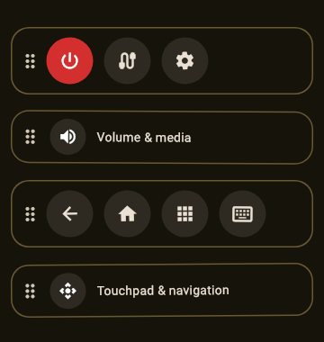
Every physical remote is somebody else’s opinion: forty buttons arranged for a spec sheet, of which a normal evening uses six. Remote apps mostly copied that opinion onto glass. The better answer, now rolling out in A Decent Remote, is to let you rearrange the remote itself.
How does the layout editor work?
Like moving apps on a home screen, but for remote controls. Drag a button to reorder it within its row, drop it on another row to move it there, drop it into a gap and a new row forms around it. The touchpad moves as a block, same as any row, so pad-first people can put it under the thumb and button-first people can shrink its territory. No themes to pick through, no locked grid: the arrangement is the feature.
Why does this matter more on a phone than on plastic?
Two reasons. Reach: phones are tall, thumbs are not, and the difference between a remote you operate one-handed and one you shuffle grip on is whether volume and OK sit in the bottom third. Honesty: TVs differ in what they can do (Philips exposes no guide command, Apple’s newer protocol no discrete mute, and every household has buttons it never presses), and a fixed layout answers that with dead buttons. A rearrangeable one lets the remote match both your TV’s reality and your habits.
What does a good custom layout look like?
The pattern that keeps winning: bottom third gets the pad or d-pad plus OK; volume rides one edge at thumb height; power, inputs and the two apps you actually open live one row up; everything else either moves to the top or leaves. Build it once, and the phone stops imitating a remote and starts beating it, especially combined with the parts plastic can never do: real keyboard typing and YouTube search on the TV.